
Preface
Richie Woo is a returning student from Dublin High, his last project with Dosenet focused on data and error analysis of our lab’s sensors. For Summer 21, Richie put together a report of his work with Dosenet analyzing radiation and wind direction data.

Introduction
My project attempted to find a correlation between wind variables, namely speed and direction, on radiation counts as detected by Dosenet’s radiation detectors at three locations in the Bay Area of California and Seattle, Washington using Python. Data obtained from airport wind towers and Dosenet radiation sensors were to be cleaned, compared, and graphed for analysis of trends in the data to find possible correlations.
Data Acquisition and Preparation
Radiation count data was obtained from Dosenet (https://radwatch.berkeley.edu/dosenet/). Wind data was obtained from cli-MATE (https://mrcc.illinois.edu/CLIMATE/welcome.jsp). All files were obtained in csv format.
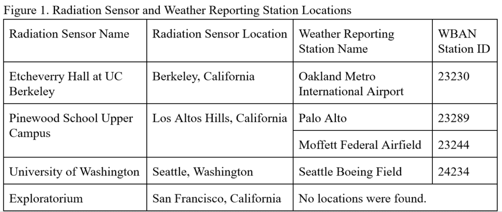
Radiation sensors were chosen based on the placement of the sensor (only sensors outdoors would be affected by wind speed and direction) and availability of wind towers from cli-MATE in a reasonable vicinity. The three radiation sensors chosen were the University of Washington, Etcheverry Hall at UC Berkeley, and the Pinewood School Upper Campus. Originally, the sensor at the Exploratorium was to be analyzed, but no wind towers were found at a reasonable distance from this sensor.
Weather reporting stations were chosen based on proximity to a Dosenet radiation sensor, availability of wind data, and recent activity. The weather reporting stations chosen were located at the Seattle Boeing Field, Oakland Metro International Airport, Palo Alto, and Moffett Federal Airfield. A detailed chart of locations and sensors is presented below.
Wind data files taken from cli-MATE often had missing values. Missing values could occur independently (that is, surrounded by existing measurements before and after), which was most common, or in a group. For each wind data file, independent missing values were extrapolated linearly, assuming that the wind speed and/or direction must have passed through the range between each measurement, and the missing value represented the average of its two surrounding values. Missing values occurring in a group could not be extrapolated. The file date and time columns were formatted into a pandas datetime format, and the whole file was sorted in ascending order by time. Then, the datetimes were converted to unix times for faster processing.
Radiation count files from Dosenet were minimally processed to remove unnecessary data (datetimes in two time zones and radiation count error margins) and format the unix timestamp to the local time.
The two datasets were then averaged per-hour and combined. Hours where no data was present for radiation count, wind speed, or wind direction were removed from the dataset. The final dataset was passed onto a series of graphing functions to create three types of graphs:
- A scatterplot of hourly radiation counts per minute compared to the wind direction in degrees (the radiation count is taken into account);
- A histogram of total number of hourly-averaged radiation count per minute measurements per 10 degrees of wind direction (the radiation count is not taken into account);
- A scatterplot of hourly radiation counts per minute compared to the wind speed in miles per hour (the radiation count is taken into account).
Analysis Procedure and Results
The only method of analysis chosen was a visual analysis of the plotly graphs generated from the python code. A more detailed explanation of the choices are described in the Discussion and Conclusion section.
All graphs were generated with Plotly Express through Python. The radiation counts are shown in hourly averages of radiation counts per minute. The wind direction is shown in degrees, with 0° representing wind blowing from the south (that is, originating from the south and heading northwards).
Below are a set of graphs from the same location set (Etcheverry Hall Roof – Oakland International Airport). A special non-Bay Area case with explanations is in the Appendix.
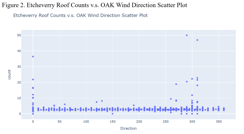
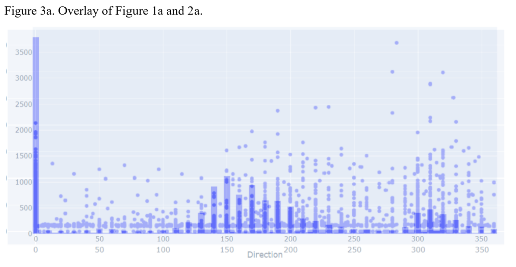
As shown in the figure, there seems to be a significant correlation between certain wind directions and spikes in radiation levels, namely around the 250°-320° range, the 0° spike, and smaller radiation spikes in the 50° and 125° areas. Otherwise, there is no significant radiation increase above the background radiation.
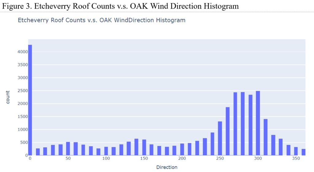
The shape of the graph presented in Figure 3 closely matches the shape of the graph in Figure 2. An overlay is presented in Figure 4.
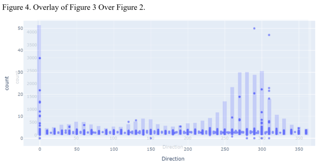
The correlation between the two graphs is evident when an overlay is created. To clarify, these are graphs of the number of wind speed measurements at a particular wind direction compared to the radiation levels at said wind directions.
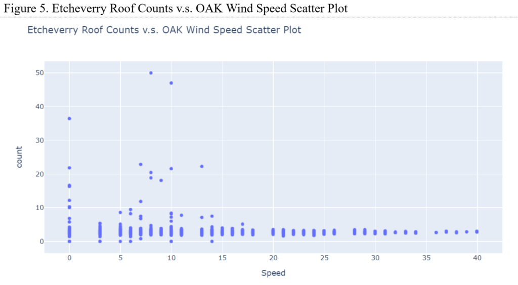
The wind speeds are not statistically significant either, with the highest speed frequencies matching a more random assortment of radiation counts, as expected.
Discussion and Conclusion
When the wind was calm (that is, the wind speed was less than one mile per hour), cli-MATE defaulted to registering all wind direction measurements to 0 degrees. Therefore, mathematical statistical analysis proved greatly biased and difficult because it was impossible to tell the true wind direction and any data was heavily skewed towards the 0° measurement. In addition, prevailing winds often skewed results heavily towards the direction these winds were headed. Random spikes in radiation levels most often occurred when the wind was facing the prevailing direction.
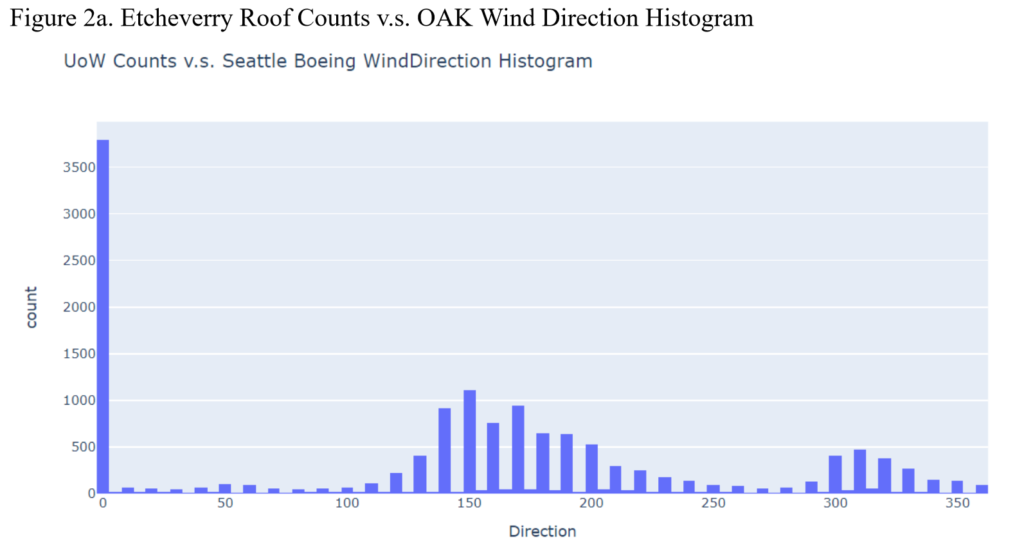
As shown in Figure 2, the alternating scatterplot “bars” are consistent with the radiation increases explained previously. Because some missing values were extrapolated linearly, the resulting direction would fall between two 10° segments. These missing values occur less often than their whole 10° segment counterparts, so logically they would have a radiation range closer to the mean. In contrast, radiation level ranges at each 10° mark would be wider simply because there is more data and therefore more variation.
With the current data and method of analysis, there is no particular correlation between wind speed or direction and radiation counts. With a more detailed analysis using spectral counts, however, a more definitive pattern may arise. Spectroscopy is generally more precise and shows a wider range of counts in different energy levels; signatures of different radiation sources may spike at particular wind directions. A further analysis must be done in the future to determine a correlation, or lack thereof, with greater statistical strength.
Appendix – University of Washington Special Case
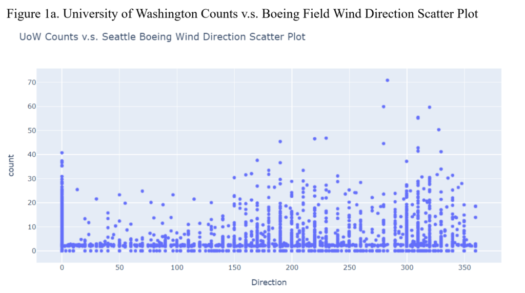
The spread of the radiation counts is far more significant than that seen in the other three locations in the Bay Area. Spikes in the data at around 200° and 325° are visible.
The prevailing winds at the University of Washington typically blow towards 150° with a significantly common wind direction towards 315°, meaning the prevailing wind blows southwards, but occasionally switches directions to the north. This is significantly different from the wind directions in the Bay Area, where the wind blows northwards.
The relation between commonality of wind direction and radiation counts is less obvious here. This may be a case where wind direction has a significant effect on radiation counts, as the non-prevailing wind seemingly has greater radiation spikes than the prevailing wind. Spectral analysis must be used to determine definitively if this is the case.