
Data Acquisition and Preparation
Air quality data was retrieved from Dosenet and PurpleAir’s respective download pages. Valid Dosenet sensors included Campolindo High School, the Etcheverry Hall Roof, Exploratorium, Harbor Bay, Miramonte High School, Pinewood School, and the University of Washington. PurpleAir sensors within ½ mile of the Dosenet Locations were found which typically amounted to 1-2 PurpleAir comparison sensors per Dosenet sensor. Specific sensor names can be found in Table 1.
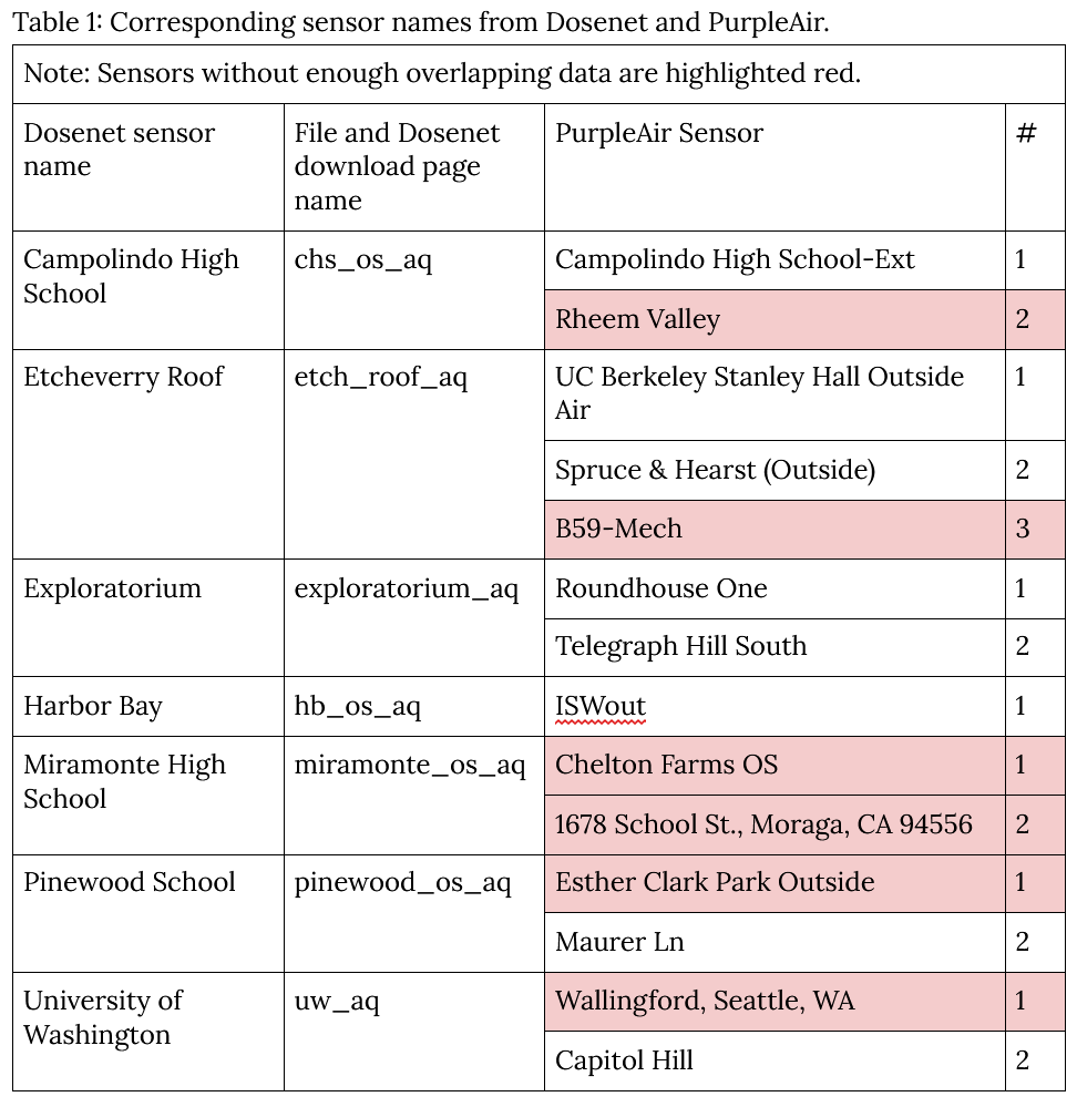
Table 1: Corresponding sensor names from Dosenet and PurpleAir.
For each sensor location, a timeframe was selected by first converting time in string format to Unix time for speed of computation, then compared for overlapping time ranges. Any rows with null values were cut from the data. The time data was then converted to DateTime format and two merged datasets were created: one averaged hourly and one averaged daily. For each dataset two .csv files were saved, one for differences with absolute value and one for raw differences. Time ranges typically encompassed several months’ worth of data. The data is stored in the “processed-air-quality-data”. Daily averages do not contain a raw difference data dataset file.
Two key locations for CO2 data comparison were Etcheverry Hall and the Exploratorium. Etcheverry Hall was chosen for its proximity to Dosenet’s home base in UC Berkeley, and the Exploratorium was chosen for its proximity to the ocean, where meaningful statistics on sensor degradation and data drift could be found due to the corrosive nature of the moist and salty environment. CO2 sensor data was retrieved from Dosenet and BEACO2N’s respective download pages. Only one BEACO2N sensor was needed for data comparison and analysis per Dosenet sensor.
The method for data preparation was very similar to that of the air quality data. However, no .csv files were generated (they can be easily generated from the source code) and differences are not absolute. In addition, BEACO2N data had to be combed for values under 0, which indicated a sensor failure at the time. Time ranges for both datasets contained almost a years’ worth of data.
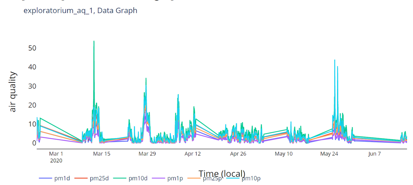
Graph 1. Exploratorium data graph.
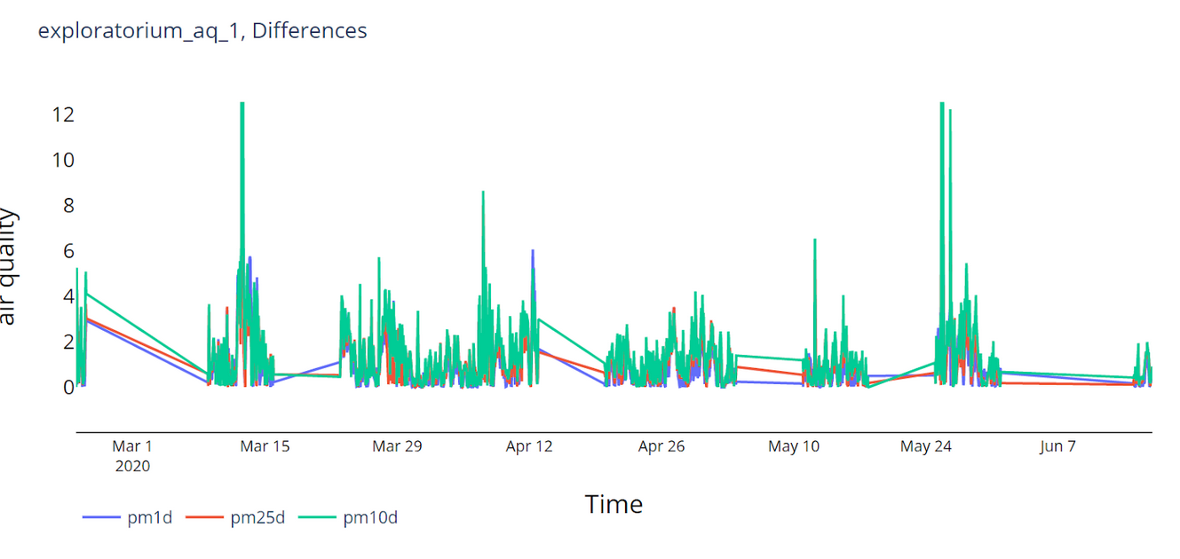
Graph 2. Exploratorium difference graph, zoomed in for clarity.
Histograms were produced with the raw data from hourly PM 2.5 hourly averages using Plotly. These also include the average of the data in the title of the graph. These histograms are useful for visually checking the distribution of the data. For the most part, difference distributions of Dosenet and PurpleAir data were Gaussian and did not deviate far from 0, but Dosenet picked up fewer particles on average than PurpleAir. Generally, Dosenet sensors picked up an average of no more than 5µg/m3 less than PurpleAir, showing that these sensors are relatively accurate. The most notable difference was the first Exploratorium sensor, in which the Dosenet sensor picked up more particles than its PurpleAir counterpart.
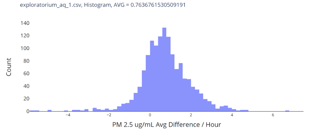
Graph 3. Exploratorium histogram including average, zoomed in for clarity.
Comparison scatterplots were made to find the strength of the linear correlation between the two air quality sensor systems, also using Plotly. For most sensors, r values were high, indicating a strong positive correlation, which is the ideal outcome. Etcheverry roof 2 and Harbor Bay had lover r values than the average, r = 0.69 and 0.777 respectively. Miramonte HS and Pinewood School did not have enough overlapping data to compare, and therefore resulted in an inaccurate r value. The second PurpleAir sensor for the University of Washington did not have any PM 2.5 data, so an r value could not be obtained.
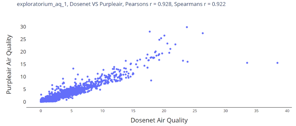
Graph 4. Exploratorium comparison scatterplot, showing a strong positive linear correlation.
BEACO2N data and Dosenet CO2 Data were compared only for the two points of interest listed in the Data Acquisition and Procedure section.
For the Exploratorium, comparison graphs were created to visually identify errors before other more detailed statistics were done. Most likely due to the nature of the location in which the sensor was placed, the Dosenet CO2 Sensor for the Exploratorium did not provide accurate or meaningful data, nor was a drift in the data present. The sensor should be replaced or recalibrated.
For the sensor at Etcheverry Roof, visual analysis from graphs showed significantly higher values from Dosenet compared to BEACO2N. Histograms show that Dosenet data is Gaussian with an average of 529 ppm whereas the more accurate BEACO2N data was heavily skewed left, at around 400 ppm. Scatterplots show a weak positive correlation with r = 0.230.
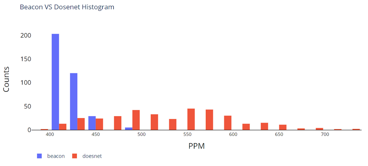
Graph 5. Etcheverry Roof Histogram, showing the difference in data distributions.
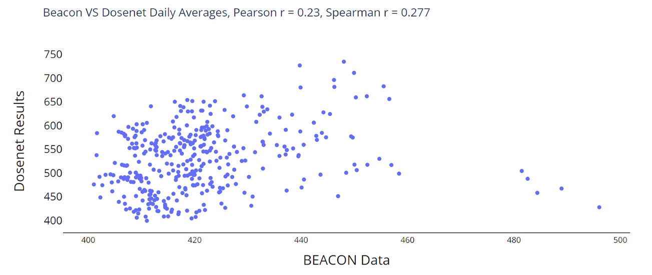
Graph 6. Comparison scatterplot of CO2 data, showing a weak positive linear correlation.