
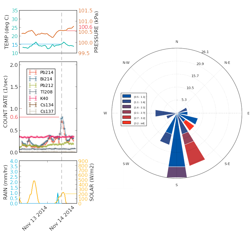
(Left) A timeseries plot of radiation and weather data. (Right) A windrose.
Timeseries
The main airsampling plot is a timeseries. Here one can see the time index along the horizontal axis. The grey line depicted on the timeseries marks Nov 13 at about 11am. Here we can read each of the individual datastreams by their vertical scales. For the time shown one can see that the count rate for 214Bi is about 0.8 counts/sec, the atmospheric pressure is 101.6 kPa, the temperature is 15 oC, there was no rain and the solar flux was about 200 W/m2.
Windrose
The plot the the right is a windrose, which holds a lot of information about wind conditions and their history. Here one can see that the rose has large 'petals' that extend away from the origin. The wind direction is captured in the direction that the petals point, with the colors indicating how fast the wind was blowing. One can see from this graph that the predominant wind was from the South, the wind blew mostly between 0.5-1.1 m/sec and blew South about 26.1% of the time.